Korean Traditional Window Grid (Changsal): Geometric Patterns for Modern UI Wireframes & Layouts
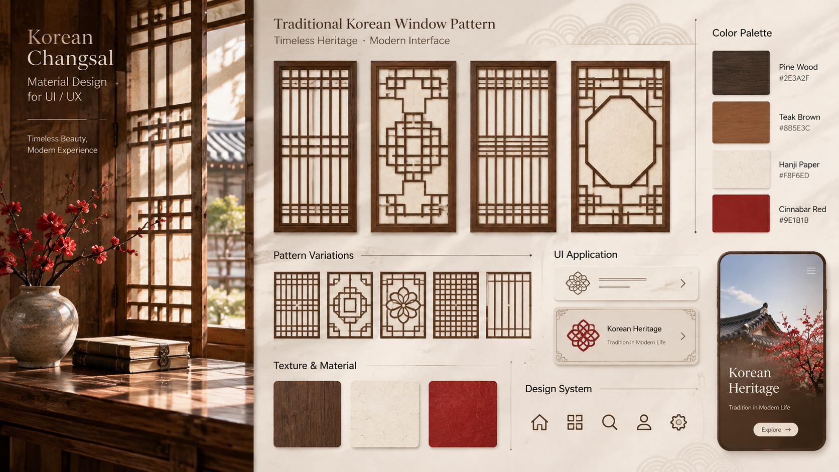
Before modern digital layouts introduced column grids and structural wireframing, traditional Korean architecture had already perfected geometric spatial divisions through Changsal (창살)—the intricate wooden lattice systems of Korean doors and windows. Combining clean linear geometry with soft, light-diffusing translucent paper (Hanji), Changsal offers an extraordinary framework for dynamic visual partitioning. For UI/UX designers and digital layout artists, these centuries-old lattice patterns provide an elegant blueprint for structuring modern screen interfaces.
Key Cultural Philosophy: Structural Harmony, Light Diffusion, and Spatial Permeability
In traditional Korean architecture (Hanok), windows and doors were designed as permeable boundaries that harmonized indoor and outdoor environments:
- Seollal & Ttisaal (Linear Rhythms): Straight vertical and horizontal wooden mullions form modular grids that maintain geometric discipline while allowing flexible proportion variations.
- Kkotsaal (Floral Lattice Geometry): Interlocking diagonal and hexagonal wooden lattices replicate blooming lotus flowers, converting functional window frames into sacred structural art.
- Chagyeong (Framing the View): Changsal grid frames act as natural viewfinders, organizing external scenery into balanced visual panels without overwhelming the observer.
Digital Color & Technical Spec Reference
Changsal geometry relies on rich aged timber tones paired with warm translucent paper neutrals. Use these precise digital specs to construct architectural UI palettes and structural wireframe tokens.
| Tone Name | Material Source | HEX Code | RGB Values | UI / Layout Function |
|---|---|---|---|---|
| Mok-jo Aged Pine | Weathered Wooden Mullion Frames | #362921 |
54, 41, 33 |
Primary grid wireframe lines, container borders, & dark UI cards |
| Changguk Teak | Polished Lattice Beam Accent | #7A5C43 |
122, 92, 67 |
Secondary grid boundaries, active states, & interactive elements |
| Changhoji Off-White | Translucent Mulberry Paper Base | #F8F4EC |
248, 244, 236 |
Primary canvas, card background fill, & soft light diffusion |
| Geun-gwan Linen | Filtered Shadow Layer | #D6C9B3 |
214, 201, 179 |
Subtle component dividers, glassmorphism shadows, & hover fills |
| Juhong Cinnabar | Royal Palace Lattice Lacquer Accent | #9E382B |
158, 56, 43 |
High-contrast focal point, call-to-action buttons, & active tab badges |
Practical Design Application (3 Ways)
1. Modular Dashboard Wireframing & Grid Layouts
Structure web app dashboards or SaaS platforms using Ttisaal (horizontal-heavy linear lattice) proportions. Applying Mok-jo Aged Pine (#362921) for clean 1px border lines across a Changhoji Off-White background creates an instantly organized, architectural wireframe system.
2. High-Fashion Editorial Cards & Media Dividers
Adopt the Chagyeong (framed view) concept by nesting high-resolution editorial photography within thin, multi-pane window grid containers. This transforms standard image grids into serene, window-like visual experiences that guide the user's eye naturally.
3. WebGL UI Panels & Translucent Glassmorphism
In interactive 3D web interfaces, render floating UI cards inspired by Changhoji paper windows. Combine a subtle noise texture overlay (2% opacity) with a low-blur glassmorphism background to recreate the gentle light-diffusing phenomenon of traditional Korean paper doors.
Pro Design Tip: When adapting Changsal lattice geometry to digital screens, avoid using heavy solid borders around every container. Instead, use thin 1px inner strokes (#7A5C43) at 40% opacity for sub-panels, keeping 100% solid lines only for main structural outer dividers. This preserves the open, light-diffusing quality inherent to Asian paper doors.
K-Aesthetics Series Guide
Explore Korean Traditional Design Assets
Discover RGB/HEX color codes, vector pattern analyses, and modern design inspiration for digital artists.
Traditional Dancheong Color Harmonies: High-Contrast Hex Codes for Digital Branding & Game Assets
Traditional Dancheong Color Harmonies: High-Contrast Hex Codes for Digital Branding & Game Assets
Traditional Dancheong Color Harmonies: High-Contrast Hex Codes for Digital Branding & Game AssetsWhen seeking striking visual impact and vibrant chromatic contrast, contemporary brand and game artists often overlook one of history's boldest color systems:
blackcat-find.com
SEO Metadata Package
Suggested Image Alt Text: Traditional Korean Changsal wooden window grid pattern displaying geometric lattice framework and color palette reference for UI UX designers
High-Search Volume SEO Tags:
Recommended Tistory Category: 미술·디자인


