Hangeul Typography & Calligraphy: Korean Modern Graphic Design Trends for Digital Artists
Hangeul is widely celebrated by linguists and designers alike as one of the most scientific, geometric alphabet systems ever created. Today, global creators are turning to Hangeul typography and dynamic calligraphy as striking editorial assets and modern graphic motifs. For digital artists seeking a fresh fusion of structured geometry and organic brushwork, mastering Hangeul aesthetics unlocks an extraordinary toolkit for avant-garde design.
Key Cultural Philosophy: Sacred Geometry Meets Expressive Flow
Created in 1443 under King Sejong the Great, Hangeul (한글) was engineered with profound philosophical intent:
- Cosmic Triad (Heaven, Earth, Human): The fundamental vowel stroke shapes are built from three symbols: a dot for Heaven (•), a horizontal line for Earth (ㅡ), and a vertical line for Human (ㅣ).
- Anatomical Consonants: Consonants visually mimic the physical shapes of the vocal organs (tongue, palate, teeth, and throat) when pronouncing each sound, resulting in pure, functional geometry.
- Calligraphic Seoye (서예): Traditional ink calligraphy balances strict grid structure with expressive energy (Gi), allowing fluid brush strokes to transform modular letter blocks into living art.
Digital Color & Technical Spec Reference
Modern Hangeul typography graphics achieve maximum visual punch by contrasting deep Sumi ink tones with clean high-contrast editorial backdrops. Use these digital specs to anchor your typographic artwork.
| Tone Name | Aesthetic Role | HEX Code | RGB Values | Design Function |
|---|---|---|---|---|
| Meok-saek | Sumi Calligraphy Ink | #121212 |
18, 18, 18 |
Primary bold typographic forms & expressive strokes |
| Hanji-baek | Aged Traditional Paper | #F7F4EF |
247, 244, 239 |
Warm editorial background to soften digital glare |
| In-jang Red | Stamp Seal Cinnabar | #C0392B |
192, 57, 43 |
Focal point accent mark & modern signature seal |
| Danchae Blue | Modernist Cyan Accent | #2980B9 |
41, 128, 185 |
Secondary pop color for layout grid overlays |
| Eun-mu Gray | Subdued Ink Wash | #7F8C8D |
127, 140, 141 |
Background watermark typography & grid lines |
Practical Design Application (3 Ways)
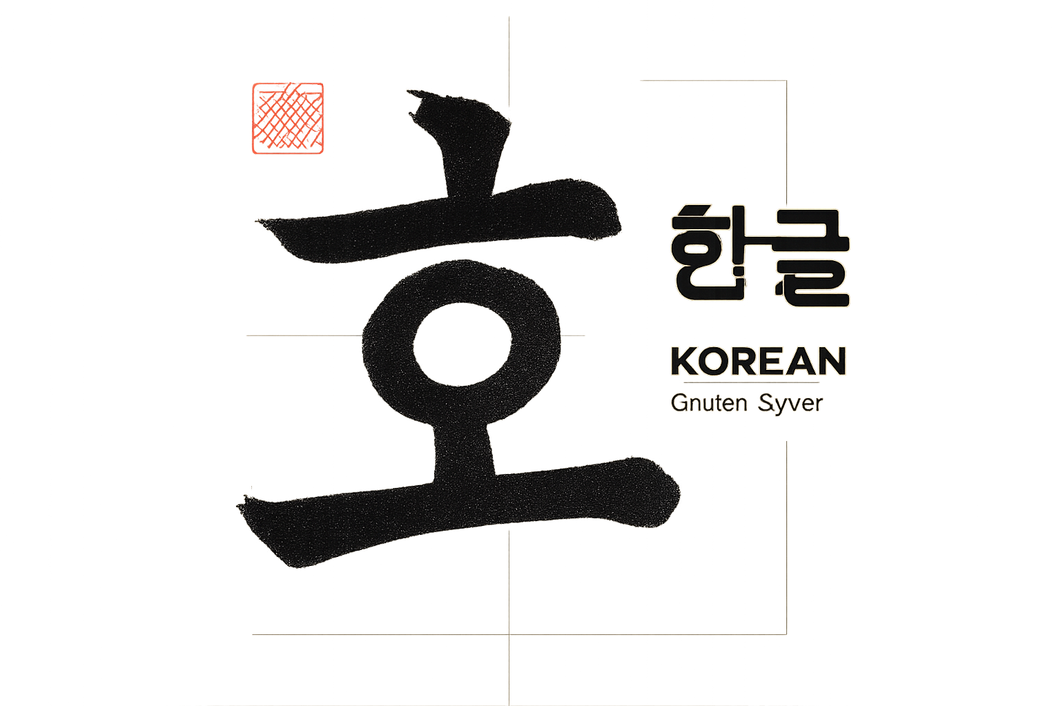
1. Editorial Packaging & Brand Identity
Treat individual Hangeul syllabic blocks (like 글 or 결) as standalone architectural logotypes. Deconstruct consonant strokes into minimalist geometric vector marks, pairing them with an In-jang Red (#C0392B) seal accent on cosmetic, tea, or luxury beverage packaging.
2. High-Fashion Web Interfaces & Hero Headers
In corporate or portfolio web design, leverage giant, semi-transparent Hangeul calligraphic letterforms as background kinetic typography. Animate the brush stroke order via SVG path animations or CSS keyframes to create captivating interactive hero sections.
3. 3D Kinetic Motion Graphics
In Cinema4D or Blender, extrude Hangeul character blocks into 3D metallic or matte ceramic sculptures. Combine fast-paced kinetic typography movement with floating calligraphic ink ribbons to generate striking fashion film graphics or event teaser posters.
Pro Design Tip: When using Hangeul in non-Korean design contexts, balance legibility with abstract form. You do not need full paragraphs; single modular syllabic blocks (Jat-nam) placed along an asymmetrical Swiss grid layout create an instantly sophisticated, high-fashion editorial aesthetic.
SEO Metadata Package
Suggested Image Alt Text: Modern Hangeul typography poster design featuring expressive Korean calligraphy strokes and minimalist geometric layouts
High-Search Volume SEO Tags:
Recommended Tistory Category: 미술·디자인
K-Aesthetics Series Guide
Explore Korean Traditional Design Assets
Discover RGB/HEX color codes, vector pattern analyses, and modern design inspiration for digital artists.


